Explaining Technical Jargon
If you would like to talk about your project call (02) 4474 5861
Responsive Web Design
What is responsive web design?
A responsive web design (RWD) allows for a website to reformat its layout and content to fit the screen size of the device it is being viewed on such as a mobile, iPad or desktop computer.
The layout and content of a responsive web design is flexible, almost organic to provide the best viewing experience possible independent of the device it is being viewed on.
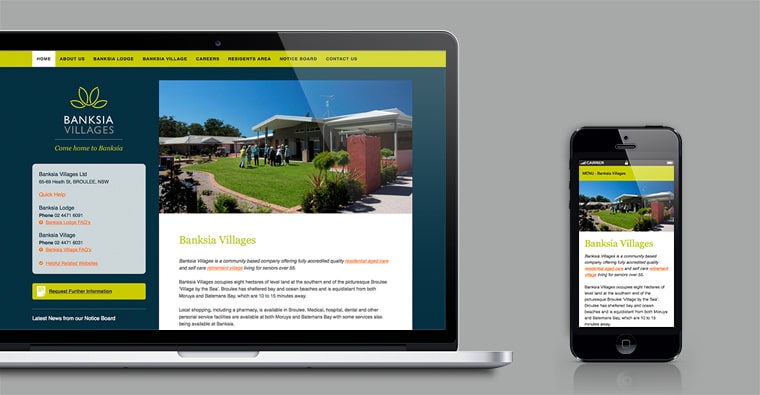
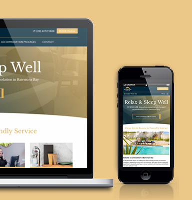
Responsive web design, showing the same website being viewed on a laptop then on a mobile phone where the website reformats itself to be more accessible to view.
Brief Responsive Web Design History
The majority of what responsive web design (RWD) offered was floating around common web development practices though it was Ethan Marcotte in 2010 (yeap 5 years ago) who crystallised the direction and coined the term “responsive web design” which opened the flood gates for the general public of web developers. The final missing link added was the ability to use CSS3 media queries to recognise device screen sizes.
What makes a website responsive?
The core ingredients to a responsive web design is
- Flexible grids
- Flexible images and media such as video
- Media queries, thanks to CSS3
Flexible layout – grid based
Underlaying most websites is a grid layout using columns, so for example this page you are viewing now uses a grid with two columns for the main content. The grid/columns are flexible so when you resize your browser window the columns width will grow or shrink to fit.
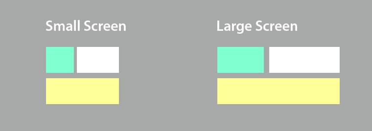
Example of how a flexible grid design works
Flexible images and media
Along with the fluid grid and layout, images and media can also be coded to be fluid within the flexible grid. This means photos or other media such as video can expand or shrink to fill the size of the screen too.
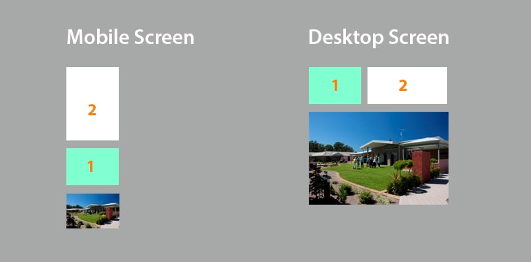
A flexible photo on the website will resize to fit the screen size.
Media queries
The final touch is by using media queries (CSS3) which detects the screen size and can tell a column to fill the whole screen 100% or 40%. The change in the website layout could be from a one column layout on a mobile screen to that of a two column layout on a desktop screen. The columns and content expand too when resizing the screen using the above two techniques.
By using the below media queries you can start to tell column widths to fill a percentage of the screen size along with other specific styling.
This CSS3 media query will apply any CSS styling for screen sizes 641 pixels or above.
// Medium screens

@media only screen and (min-width: 641px) { }
This CSS3 media query will apply any CSS styling for screen sizes 1025 pixels or above.
// Large screens

@media only screen and (min-width: 1025px) { }
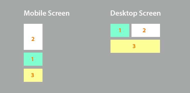
By using CSS3 media queries, columns expand to fill 100% or 40% of the devices screen.
Benefits of Responsive Web Design
- Google will use RWD as a search result ranking
- Adds another layer of accessibility
- Reduce the need/costs to maintain a separate mobile website
This Article is From:
Explaining Technical JargonLast updated on
Recent Articles from Design Thinking
- Moruya Bypass Poll – Which option do you prefer?
- Clear Definition of an SEO Keyword Strategy
- SurfEars 3.0 Review
Design Thinking Sections
- Business Tools
- Design Process
- Designers Bookshelf
- Ecommerce – Shopping Carts
- Explaining Technical Jargon
- Industry Leaders Say
- Interesting & Creative
- Marketing Fundamentals
- Online Video Tutorials
- Professional Development
- SEO – Search Engine Optimisation
- Social Media
- Typography & Fonts
- UX Design & App Development
- Web Accessibility
- Web Design & Development
- WordPress – Custom Themes & Development

Instinctively creative & thoughtful strategies with result orientated outcomes
Visually communicating effectively with your potential & current customers adds to the good business experience.
BJ2DESIGN combines a wealth of design knowledge with creative business strategies to create result oriented work.