Design Thinking
If you would like to talk about your project call (02) 4474 5861
Eurobodalla Signage – Batemans Bay, Moruya & Narooma Town Signs
You may have noticed the new signs that Eurobodalla Shire Council has had erected at the entrances to the towns of Narooma, Moruya and Batemans Bay.
How happy is the Moruya, Batemans Bay and Narooma community about the overall design and aesthetics of their new town signs?
(Below you can add your comments to this page or vote via the poll if you wish).
Moruya, Narooma & Batemans Bay Town Signage
Scroll to the bottom of the page to read and make comments.
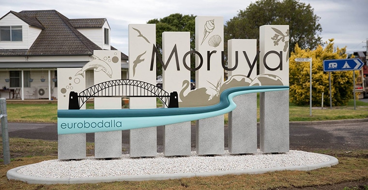
Moruya town entrance sign. Photo courtesy of Toby Whitelaw, local photographer, artist & graphic designer.
Share your thoughts about the new town signs
Opinions of aesthetics / art is always up for controversy and discussion to what is vulgar and that of beauty. In saying that there are fundamental principles of art to help convey a meaning of the object/subject matter. Similarly when it comes to design there are fundamental practices which can be followed to make sure at minimum that a design meets specific outcomes of functionality.
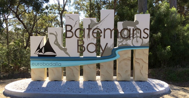
Batemans Bay Town entrance sign design.
Does the overall look and feel of the signs function as a clear welcoming message to the town? Is it a sign you are happy to look at as you come and go from your local town?
Looking for community feedback on your feelings about the signs, the good, bad and ugly.
Lets hear what you have to say:
18 thoughts on “Eurobodalla Signage – Batemans Bay, Moruya & Narooma Town Signs”
Write a Reply or Comment
This Article is From:
Design ThinkingLast updated on
Recent Articles from Design Thinking
- Moruya Bypass Poll – Which option do you prefer?
- Clear Definition of an SEO Keyword Strategy
- SurfEars 3.0 Review
Design Thinking Sections
- Business Tools
- Design Process
- Designers Bookshelf
- Ecommerce – Shopping Carts
- Explaining Technical Jargon
- Industry Leaders Say
- Interesting & Creative
- Marketing Fundamentals
- Online Video Tutorials
- Professional Development
- SEO – Search Engine Optimisation
- Social Media
- Typography & Fonts
- UX Design & App Development
- Web Accessibility
- Web Design & Development
- WordPress – Custom Themes & Development


Instinctively creative & thoughtful strategies with result orientated outcomes
Visually communicating effectively with your potential & current customers adds to the good business experience.
BJ2DESIGN combines a wealth of design knowledge with creative business strategies to create result oriented work.

The signs look lovely, I like that they have been personalised for each town. It is just a big shame that the Yuin (Aboriginal) culture was not symbolised as well. I see this as a major oversight. It is something which is important not only for respect to the culture but also for tourism for the region.
With such a vibrant local arts community I think it would have been ideal to involve them in the design and manufacture of suitable and relevant signs. I’m afraid I find these signs quite ugly.
Don’t get the Sydney Harbour reference?
Hi Aaron, a lot of the granite used in the piers of the Sydney Harbour Bridge was quarried from Moruya. Also the columns of Sydney GPO and the base of the Captain cook Statue in Hyde Park use granite from Moruya.
And the Cenotaph. Take a close look at the bridge on the sign, the roadway is above the arches. The webbing is misaligned at the centre. But mainly it’s unexplained. Here’s the old hand painted metal sign which actually explained the connection. I prefer it. https://aussietowns.files.wordpress.com/2015/04/moruya-town-sign.jpg
Hi Toby, I do know partial history to the old sign, was actually at those meetings when Moruya Chamber of Commerce (now Moruya Business Chamber) was discussing what they should do in regards to the design / text.
From memory the decision was made within one or two meetings. Everyone agreed the words “welcome to” and of course the word Moruya needed to be on the sign. At a last minute discussion a few of us thought that the history of Moruya supplying the granite for the foundations of the Sydney Harbour Bridge was quiet significant. To link the Sydney Harbour Bridge and Moruya together seemed like a true highlight/connection to one of Australia’s major icons and tourist destinations, well worth putting on anyones Towns CV (Moruya has a great list of things going for it, the bridge/granite supply is just one of them).
As a group we decided upon no imagery, just to make sure the name of the town was clear on the sign. There was a rough pen sketch done on paper and then handed over to a local sign writer (maybe there was something more formal supplied to the Eurobodalla Shire Council), which I do believe you can see their signature on the bottom right of the sign in that photo you linked. The sign writer did the typography as they wished and Wa-lah one sign done and dusted.
The old sign was all done locally, with minimum fuss while still achieving a good outcome and functional sign.
With the new sign I had no prior knowledge of it or that it was in the pipeline for discussion among the Chamber members at Moruya. This is more then likely due to me not going to meetings over the last year or so due to other family/community commitments.
Just trying to get to the bottom of things… did you design these signs?
Hi Trish,
No I did not design these signs.
From what I’ve heard/read it was a combination of Eurobodalla Shire Council, Batemans Bay, Moruya & Narooma Chambers of Commerce and a sign design company from Inverell NSW.
There is some more information regarding the signs on the Narooma News website:
http://www.naroomanewsonline.com.au/story/4059304/unhappiness-expressed-at-new-town-signs/
A lot of the facts about the signs are laid out in this submission I made to Council – http://www.esc.nsw.gov.au/inside-council/council/meetings/information/public-access-session/2016/toby-whitelaw-26-july-2016
Thanks for the link…
oh dear what a mess, nothing good to say about these signs and the ridiculous waste of money. Such a shame.
The worst thing is, they will probably be in place for years.
There are many basic design faults with the signs such as poor location of typography, choice of appropriate materials but most importantly the misrepresentation of the shire logo. How the council could approve six large signs with only two of the three rivers that appear on their logo is embarrassing.
Good point Peter. The policy specifies that it should include the ‘linear mountain shape’ and something called the ‘positioning statement’. It also calls for ‘Eurobodalla South Coast NSW’ but if you’re looking at the sign and don’t already know you’re in south coast NSW you’ve got bigger problems. So much public money spent on such a clumsy outcome.
Yes it’s ugly and looks like a mish-mash of too many ideas, but I’m equally concerned about the religious symbolism of the “seven pillars of wisdom” – I’m not happy about this religious ‘code’ identifying my town.
Although new signs were needed for the town I feel the design is amateur and embarrassing. Involving the community and using local designers would have been a better idea. The apparent religious symbolism of the sign is also weird and does not reflect the community.
Motorists have no chance to take in ALL the details of these signs.
These signs in my opinion are an absolute, in almost every detail, a complete f**k up. An obvious outcome of too many cooks spoiling the broth.
Besides all the detail, OR lack of it re: the indigenous representation… The name of the towns is NOT clear…. a failure on the most basic level.
As a local, I know the names, but for a tourist it does not deliver.
As a design professional I am appalled by the breech of basic design principles. An aesthetic abomination and even worse, difficult to read.
I find myself still embarrassed and cringing every time I drive past these signs due to tacky design which so lacks any artistic skills. Just cannot believe that they were approved by ESC and the total disregard of acknowledgement of the local Indigenous community and their important history is very concerning.
Just Stunning.
I am in disbelief there could be any criticism.
What in the world is going on in the minds of some people.