If you would like to talk about your project call (02) 4474 5861
Linocut Logo Design Process – Byron Bay Logo Design
Working on a Byron Bay clients logo and needed to create an illustrative linocut logo design.
By BJ2DESIGN – Australian Logo Designer.
Initially started at looking to use an Illustrator brush that mimics a linocut look and feel but have opted to use the traditional craft method of actually doing a linocut for the logo / illustration.
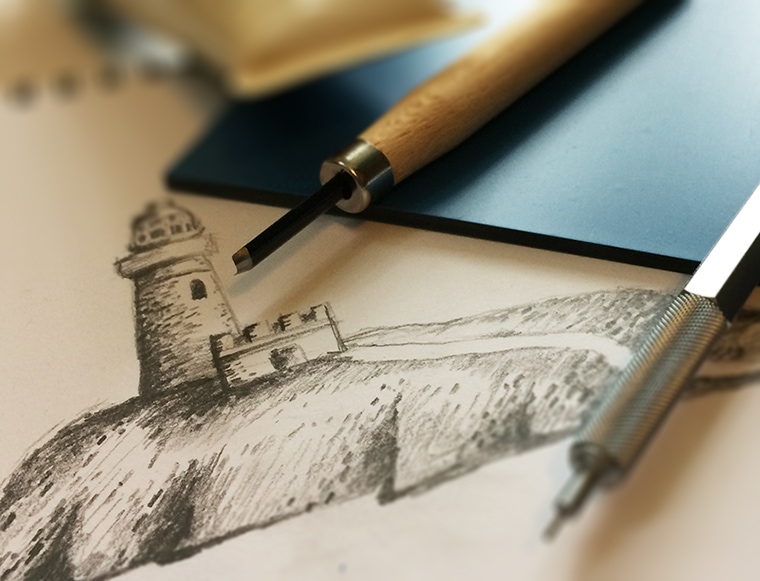
Linocut Logo Design – The final approved sketch by the client, ready to redraw and cut from the lino.
Linocut Logo Process & Tools
After first presented a number of illustrative sketches for the direction, look & feel of the logo based on the logo design brief, one logo concept was selected.
With the selected concept which will use the Byron Bay lighthouse another round of refining the logo, in particular the illustrative sketch was then approved.
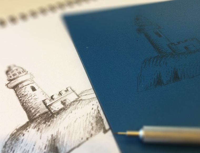
Drawing the logo design / illustration of Byron Bay lighthouse onto the lino.
Then the sketch / illustration of the Byron Bay lighthouse was hand drawn onto the lino where it was cut out using lino tools, which are a bit like small chisels.
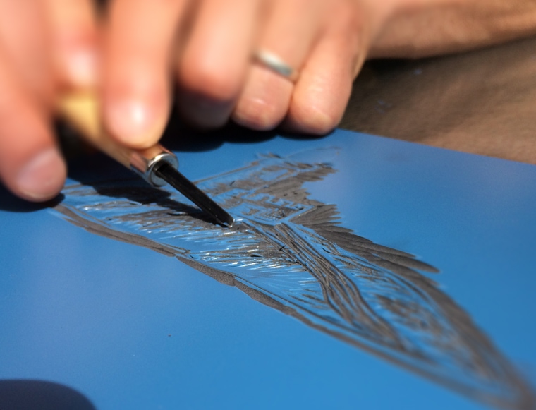
Cutting the logo out of the lino.
The next step was then to do a printed proof of the linocut but instead side stepped the inking and printing process by doing a scan of the lino cut via computer.
There are some slight modifications needed to be done so you can see the first linocut done below and following this will be another version of the same linocut image.
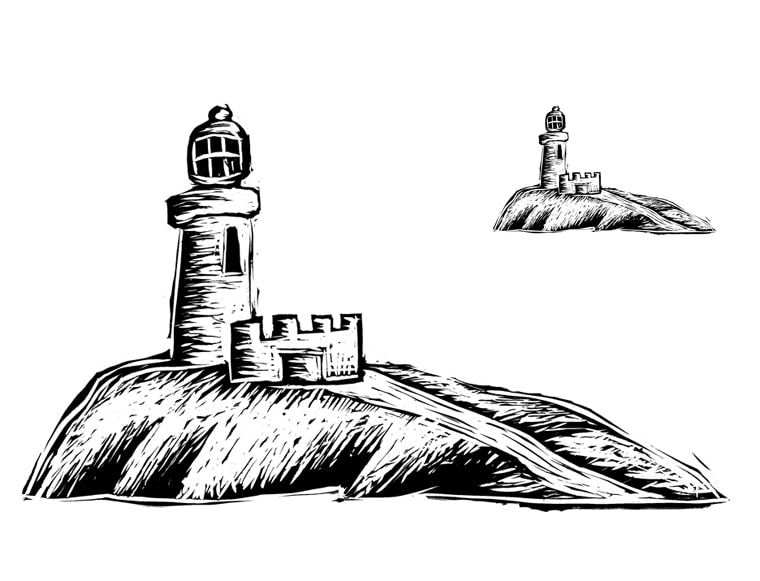
Scan taken from the linocut revealing the illustration of Byron Bay lighthouse for the logo.
Reworking the Linocut Illustration
After reviewing the first linocut illustration the decision was made to do another lino cut for the illustration.

Illustration for a logo using the technique of linocut.
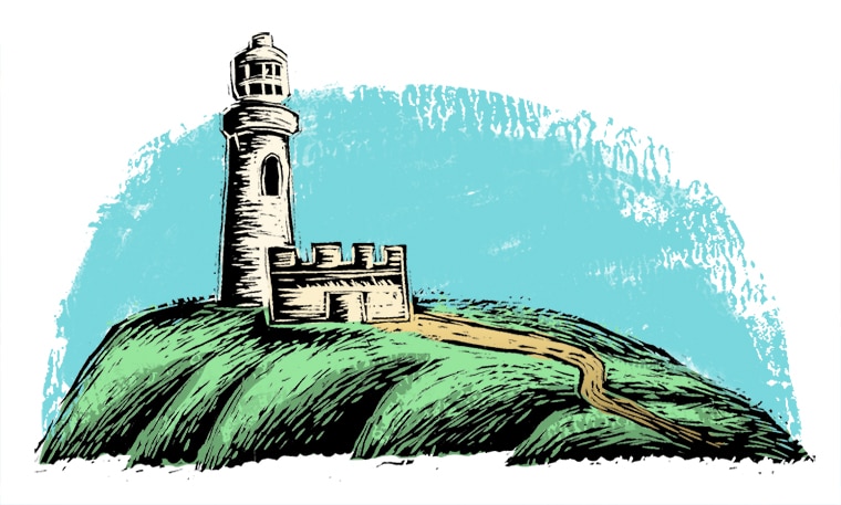
Using Photoshop to colour the linocut logo illustration of Byron Bay lighthouse.
This Article is From:
Design ProcessLast updated on
Recent Articles from Design Thinking
- Moruya Bypass Poll – Which option do you prefer?
- Clear Definition of an SEO Keyword Strategy
- SurfEars 3.0 Review
Design Thinking Sections
- Business Tools
- Design Process
- Designers Bookshelf
- Ecommerce – Shopping Carts
- Explaining Technical Jargon
- Industry Leaders Say
- Interesting & Creative
- Marketing Fundamentals
- Online Video Tutorials
- Professional Development
- SEO – Search Engine Optimisation
- Social Media
- Typography & Fonts
- UX Design & App Development
- Web Accessibility
- Web Design & Development
- WordPress – Custom Themes & Development
Instinctively creative & thoughtful strategies with result orientated outcomes
Visually communicating effectively with your potential & current customers adds to the good business experience.
BJ2DESIGN combines a wealth of design knowledge with creative business strategies to create result oriented work.
