Web Design & Development
If you would like to talk about your project call (02) 4474 5861
What makes a website mobile friendly?
When creating a website to be mobile friendly there are a number of factors to consider and implement. This list will be taking a responsive web design approach and not of that of a separate mobile site (which this list can still be applied).
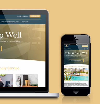
- Responsive Web Design
- Mobile First Coding
- Leverage browser caching
- Image Optimisation – compress & resize where possible
- Optimise CSS Delivery
- Minify CSS & HTML Files
Leverage browser caching
When a browser loads a webpage it will download a number of web files to properly display the page. This includes all the HTML, CSS, javascript and images.
By setting caching parameters in the .htaccess file you can tell the browser what types of files to cache on the computer and how often to look at the website to download the file again.
Image Optimisation
Make sure that images are compressed & resized where possible as this can reduce the download size and help create a better viewing experience on mobile.
Optimise CSS Delivery
Before your website CSS gets applied to your content all the CSS information needs to be downloaded first. By using media queries and mobile first techniques you can ensure only what is need for the mobile version of your site will loaded as fast as possible and first.
Minify CSS & HTML Files
When coding be sure to as much as possible write short naming conventions and shorthand properties while retaining semantic meaning. Look at removing any unused code, comments and space. Look at minifying your css file too.
Additional resources:
This Article is From:
Web Design & DevelopmentLast updated on
Recent Articles from Design Thinking
- Moruya Bypass Poll – Which option do you prefer?
- Clear Definition of an SEO Keyword Strategy
- SurfEars 3.0 Review
Design Thinking Sections
- Business Tools
- Design Process
- Designers Bookshelf
- Ecommerce – Shopping Carts
- Explaining Technical Jargon
- Industry Leaders Say
- Interesting & Creative
- Marketing Fundamentals
- Online Video Tutorials
- Professional Development
- SEO – Search Engine Optimisation
- Social Media
- Typography & Fonts
- UX Design & App Development
- Web Accessibility
- Web Design & Development
- WordPress – Custom Themes & Development

Instinctively creative & thoughtful strategies with result orientated outcomes
Visually communicating effectively with your potential & current customers adds to the good business experience.
BJ2DESIGN combines a wealth of design knowledge with creative business strategies to create result oriented work.